How to Create a Research Poster
- Poster Basics
- Design Tips
- Logos & Images

What is a Research Poster?
Posters are widely used in the academic community, and most conferences include poster presentations in their program. Research posters summarize information or research concisely and attractively to help publicize it and generate discussion.
The poster is usually a mixture of a brief text mixed with tables, graphs, pictures, and other presentation formats. At a conference, the researcher stands by the poster display while other participants can come and view the presentation and interact with the author.
What Makes a Good Poster?
- Important information should be readable from about 10 feet away
- Title is short and draws interest
- Word count of about 300 to 800 words
- Text is clear and to the point
- Use of bullets, numbering, and headlines make it easy to read
- Effective use of graphics, color and fonts
- Consistent and clean layout
- Includes acknowledgments, your name and institutional affiliation
A Sample of a Well Designed Poster
View this poster example in a web browser .
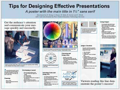
Image credit: Poster Session Tips by [email protected], via Penn State
Where do I begin?
Answer these three questions:.
- What is the most important/interesting/astounding finding from my research project?
- How can I visually share my research with conference attendees? Should I use charts, graphs, photos, images?
- What kind of information can I convey during my talk that will complement my poster?
What software can I use to make a poster?
A popular, easy-to-use option. It is part of Microsoft Office package and is available on the library computers in rooms LC337 and LC336. ( Advice for creating a poster with PowerPoint ).
Adobe Illustrator, Photoshop, and InDesign
Feature-rich professional software that is good for posters including lots of high-resolution images, but they are more complex and expensive. NYU Faculty, Staff, and Students can access and download the Adobe Creative Suite .
Open Source Alternatives
- OpenOffice is the free alternative to MS Office (Impress is its PowerPoint alternative).
- Inkscape and Gimp are alternatives to Adobe products.
- For charts and diagrams try Gliffy or Lovely Charts .
- A complete list of free graphics software .
A Sample of a Poorly Designed Poster
View this bad poster example in a browser.
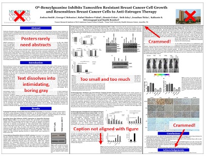
Image Credit: Critique by Better Posters
- Next: Design Tips >>
- Last Updated: Jul 9, 2024 5:34 PM
- URL: https://guides.nyu.edu/posters
Home Blog Design How to Design a Winning Poster Presentation: Quick Guide with Examples & Templates
How to Design a Winning Poster Presentation: Quick Guide with Examples & Templates
How are research posters like High School science fair projects? Quite similar, in fact.
Both are visual representations of a research project shared with peers, colleagues and academic faculty. But there’s a big difference: it’s all in professionalism and attention to detail. You can be sure that the students that thrived in science fairs are now creating fantastic research posters, but what is that extra element most people miss when designing a poster presentation?
This guide will teach tips and tricks for creating poster presentations for conferences, symposia, and more. Learn in-depth poster structure and design techniques to help create academic posters that have a lasting impact.
Let’s get started.
Table of Contents
- What is a Research Poster?
Why are Poster Presentations important?
Overall dimensions and orientation, separation into columns and sections, scientific, academic, or something else, a handout with supplemental and contact information, cohesiveness, design and readability, storytelling.
- Font Characteristics
- Color Pairing
- Data Visualization Dimensions
- Alignment, Margins, and White Space
Scientific/Academic Conference Poster Presentation
Digital research poster presentations, slidemodel poster presentation templates, how to make a research poster presentation step-by-step, considerations for printing poster presentations, how to present a research poster presentation, final words, what is a research poster .
Research posters are visual overviews of the most relevant information extracted from a research paper or analysis. They are essential communication formats for sharing findings with peers and interested people in the field. Research posters can also effectively present material for other areas besides the sciences and STEM—for example, business and law.
You’ll be creating research posters regularly as an academic researcher, scientist, or grad student. You’ll have to present them at numerous functions and events. For example:
- Conference presentations
- Informational events
- Community centers
The research poster presentation is a comprehensive way to share data, information, and research results. Before the pandemic, the majority of research events were in person. During lockdown and beyond, virtual conferences and summits became the norm. Many researchers now create poster presentations that work in printed and digital formats.
Let’s look at why it’s crucial to spend time creating poster presentations for your research projects, research, analysis, and study papers.
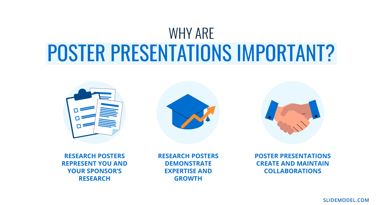
Research posters represent you and your sponsor’s research
Research papers and accompanying poster presentations are potent tools for representation and communication in your field of study. Well-performing poster presentations help scientists, researchers, and analysts grow their careers through grants and sponsorships.
When presenting a poster presentation for a sponsored research project, you’re representing the company that sponsored you. Your professionalism, demeanor, and capacity for creating impactful poster presentations call attention to other interested sponsors, spreading your impact in the field.
Research posters demonstrate expertise and growth
Presenting research posters at conferences, summits, and graduate grading events shows your expertise and knowledge in your field of study. The way your poster presentation looks and delivers, plus your performance while presenting the work, is judged by your viewers regardless of whether it’s an officially judged panel.
Recurring visitors to research conferences and symposia will see you and your poster presentations evolve. Improve your impact by creating a great poster presentation every time by paying attention to detail in the poster design and in your oral presentation. Practice your public speaking skills alongside the design techniques for even more impact.
Poster presentations create and maintain collaborations
Every time you participate in a research poster conference, you create meaningful connections with people in your field, industry or community. Not only do research posters showcase information about current data in different areas, but they also bring people together with similar interests. Countless collaboration projects between different research teams started after discussing poster details during coffee breaks.
An effective research poster template deepens your peer’s understanding of a topic by highlighting research, data, and conclusions. This information can help other researchers and analysts with their work. As a research poster presenter, you’re given the opportunity for both teaching and learning while sharing ideas with peers and colleagues.
Anatomy of a Winning Poster Presentation
Do you want your research poster to perform well? Following the standard layout and adding a few personal touches will help attendees know how to read your poster and get the most out of your information.
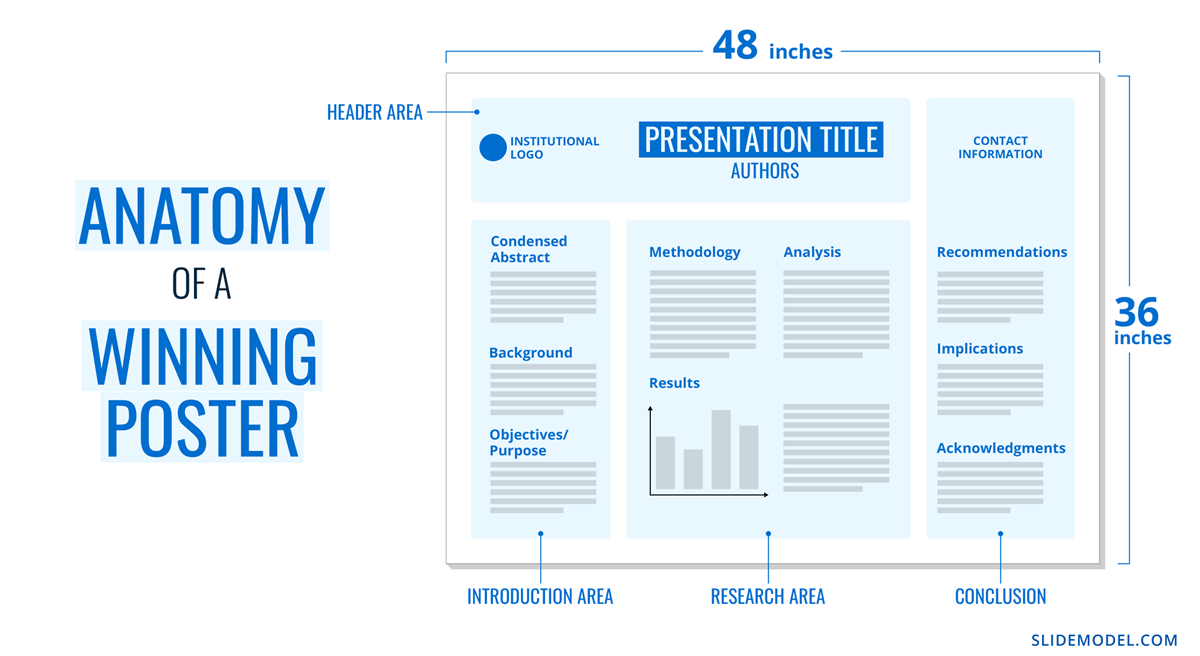
The overall size of your research poster ultimately depends on the dimensions of the provided space at the conference or research poster gallery. The poster orientation can be horizontal or vertical, with horizontal being the most common. In general, research posters measure 48 x 36 inches or are an A0 paper size.
A virtual poster can be the same proportions as the printed research poster, but you have more leeway regarding the dimensions. Virtual research posters should fit on a screen with no need to scroll, with 1080p resolution as a standard these days. A horizontal presentation size is ideal for that.
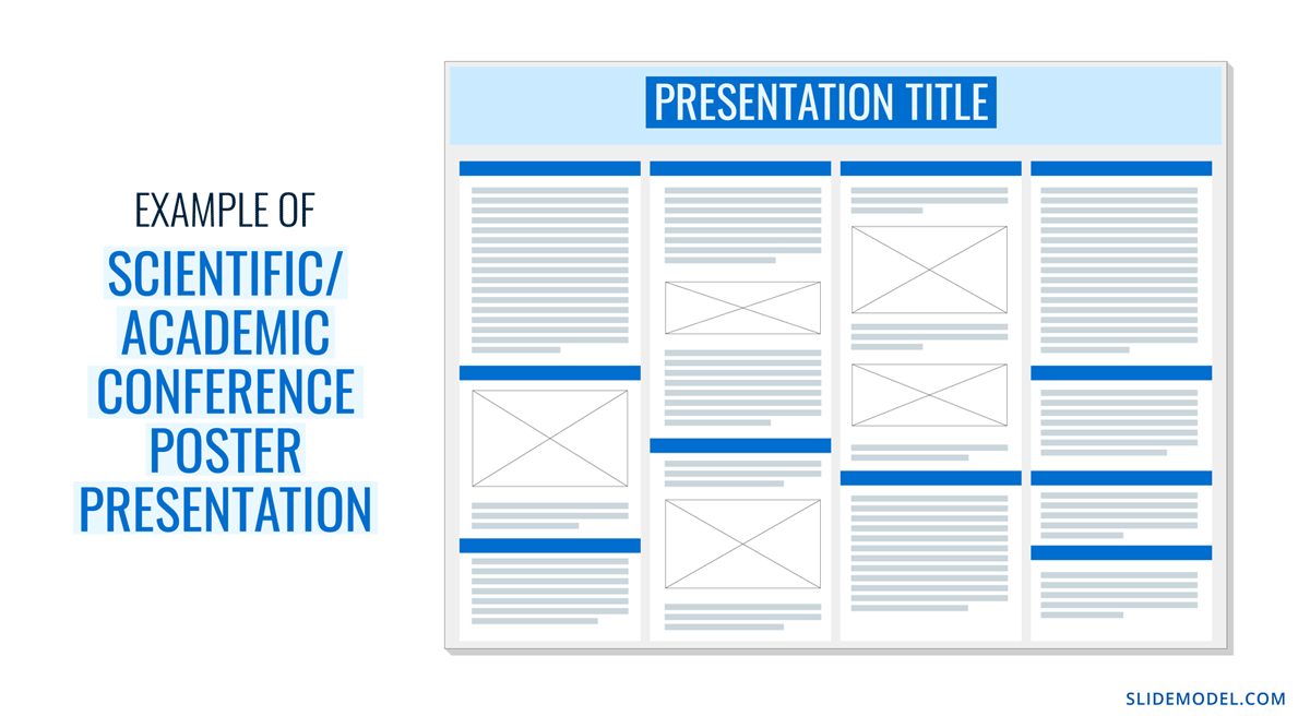
A research poster presentation has a standard layout of 2–5 columns with 2–3 sections each. Typical structures say to separate the content into four sections; 1. A horizontal header 2. Introduction column, 3. Research/Work/Data column, and 4. Conclusion column. Each unit includes topics that relate to your poster’s objective. Here’s a generalized outline for a poster presentation:
- Condensed Abstract
- Objectives/Purpose
- Methodology
- Recommendations
- Implications
- Acknowledgments
- Contact Information
The overview content you include in the units depends on your poster presentations’ theme, topic, industry, or field of research. A scientific or academic poster will include sections like hypothesis, methodology, and materials. A marketing analysis poster will include performance metrics and competitor analysis results.
There’s no way a poster can hold all the information included in your research paper or analysis report. The poster is an overview that invites the audience to want to find out more. That’s where supplement material comes in. Create a printed PDF handout or card with a QR code (created using a QR code generator ). Send the audience to the best online location for reading or downloading the complete paper.
What Makes a Poster Presentation Good and Effective?
For your poster presentation to be effective and well-received, it needs to cover all the bases and be inviting to find out more. Stick to the standard layout suggestions and give it a unique look and feel. We’ve put together some of the most critical research poster-creation tips in the list below. Your poster presentation will perform as long as you check all the boxes.
The information you choose to include in the sections of your poster presentation needs to be cohesive. Train your editing eye and do a few revisions before presenting. The best way to look at it is to think of The Big Picture. Don’t get stuck on the details; your attendees won’t always know the background behind your research topic or why it’s important.
Be cohesive in how you word the titles, the length of the sections, the highlighting of the most important data, and how your oral presentation complements the printed—or virtual—poster.
The most important characteristic of your poster presentation is its readability and clarity. You need a poster presentation with a balanced design that’s easy to read at a distance of 1.5 meters or 4 feet. The font size and spacing must be clear and neat. All the content must suggest a visual flow for the viewer to follow.
That said, you don’t need to be a designer to add something special to your poster presentation. Once you have the standard—and recognized—columns and sections, add your special touch. These can be anything from colorful boxes for the section titles to an interesting but subtle background, images that catch the eye, and charts that inspire a more extended look.
Storytelling is a presenting technique involving writing techniques to make information flow. Firstly, storytelling helps give your poster presentation a great introduction and an impactful conclusion.
Think of storytelling as the invitation to listen or read more, as the glue that connects sections, making them flow from one to another. Storytelling is using stories in the oral presentation, for example, what your lab partner said when you discovered something interesting. If it makes your audience smile and nod, you’ve hit the mark. Storytelling is like giving a research presentation a dose of your personality, and it can help turning your data into opening stories .
Design Tips For Creating an Effective Research Poster Presentation
The section above briefly mentioned how important design is to your poster presentation’s effectiveness. We’ll look deeper into what you need to know when designing a poster presentation.
1. Font Characteristics
The typeface and size you choose are of great importance. Not only does the text need to be readable from two meters away, but it also needs to look and sit well on the poster. Stay away from calligraphic script typefaces, novelty typefaces, or typefaces with uniquely shaped letters.
Stick to the classics like a sans serif Helvetica, Lato, Open Sans, or Verdana. Avoid serif typefaces as they can be difficult to read from far away. Here are some standard text sizes to have on hand.
- Title: 85 pt
- Authors: 65 pt
- Headings: 36 pt
- Body Text: 24 pt
- Captions: 18 pt
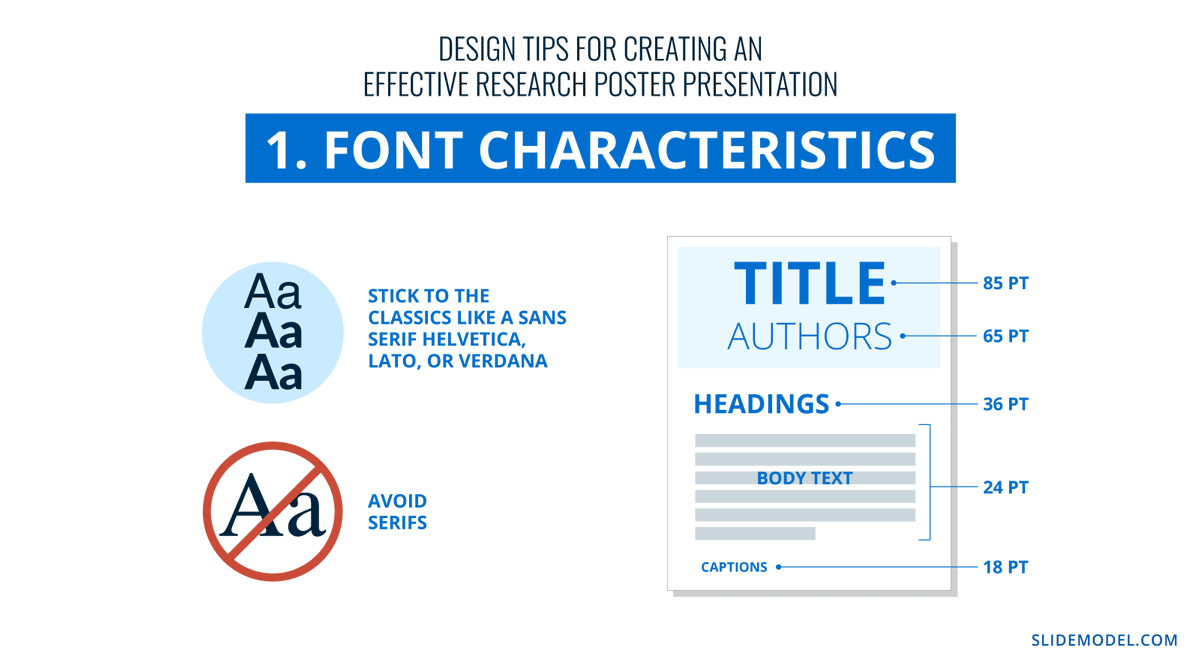
If you feel too prone to use serif typefaces, work with a font pairing tool that helps you find a suitable solution – and intend those serif fonts for heading sections only. As a rule, never use more than 3 different typefaces in your design. To make it more dynamic, you can work with the same font using light, bold, and italic weights to put emphasis on the required areas.
2. Color Pairing
Using colors in your poster presentation design is a great way to grab the viewer’s attention. A color’s purpose is to help the viewer follow the data flow in your presentation, not distract. Don’t let the color take more importance than the information on your poster.
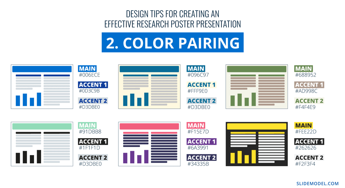
Choose one main color for the title and headlines and a similar color for the data visualizations. If you want to use more than one color, don’t create too much contrast between them. Try different tonalities of the same color and keep things balanced visually. Your color palette should have at most one main color and two accent colors.
Black text over a white background is standard practice for printed poster presentations, but for virtual presentations, try a very light gray instead of white and a very dark gray instead of black. Additionally, use variations of light color backgrounds and dark color text. Make sure it’s easy to read from two meters away or on a screen, depending on the context. We recommend ditching full white or full black tone usage as it hurts eyesight in the long term due to its intense contrast difference with the light ambiance.
3. Data Visualization Dimensions
Just like the text, your charts, graphs, and data visualizations must be easy to read and understand. Generally, if a person is interested in your research and has already read some of the text from two meters away, they’ll come closer to look at the charts and graphs.
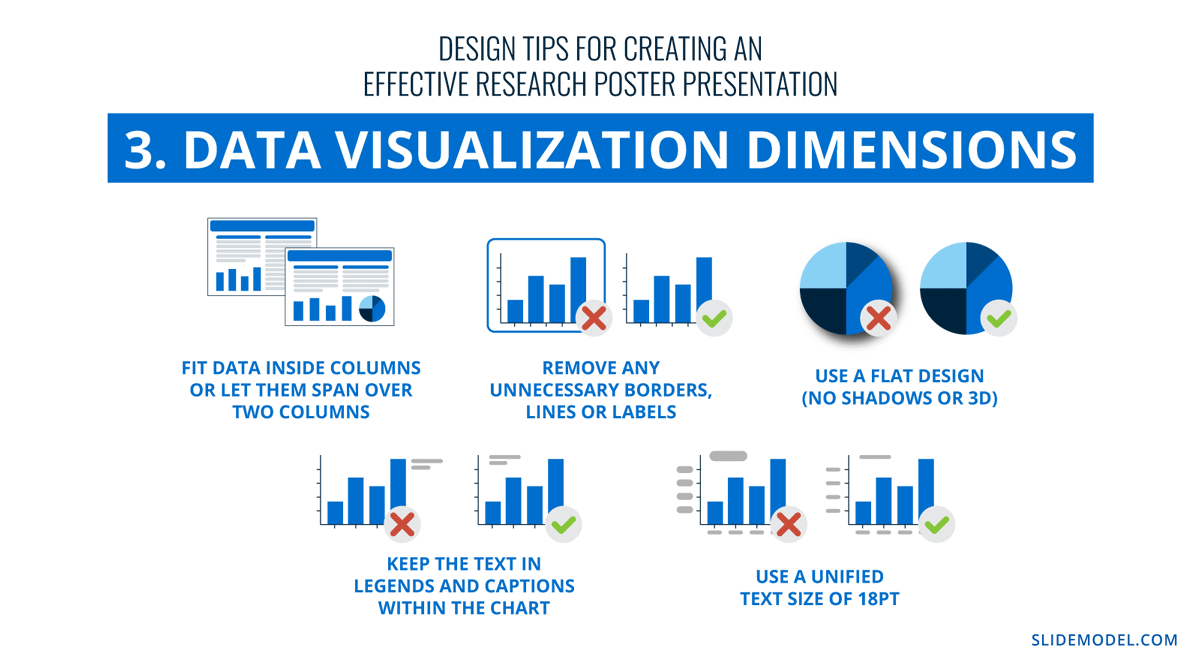
Fit data visualizations inside columns or let them span over two columns. Remove any unnecessary borders, lines, or labels to make them easier to read at a glance. Use a flat design without shadows or 3D characteristics. The text in legends and captions should stay within the chart size and not overflow into the margins. Use a unified text size of 18px for all your data visualizations.
4. Alignment, Margins, and White Space
Finally, the last design tip for creating an impressive and memorable poster presentation is to be mindful of the layout’s alignment, margins, and white space. Create text boxes to help keep everything aligned. They allow you to resize, adapt, and align the content along a margin or grid.
Take advantage of the white space created by borders and margins between sections. Don’t crowd them with a busy background or unattractive color.
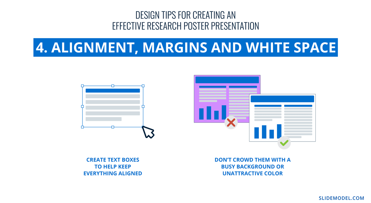
Calculate margins considering a print format. It is a good practice in case the poster presentation ends up becoming in physical format, as you won’t need to downscale your entire design (affecting text readability in the process) to preserve information.
There are different tools that you can use to make a poster presentation. Presenters who are familiar with Microsoft Office prefer to use PowerPoint. You can learn how to make a poster in PowerPoint here.
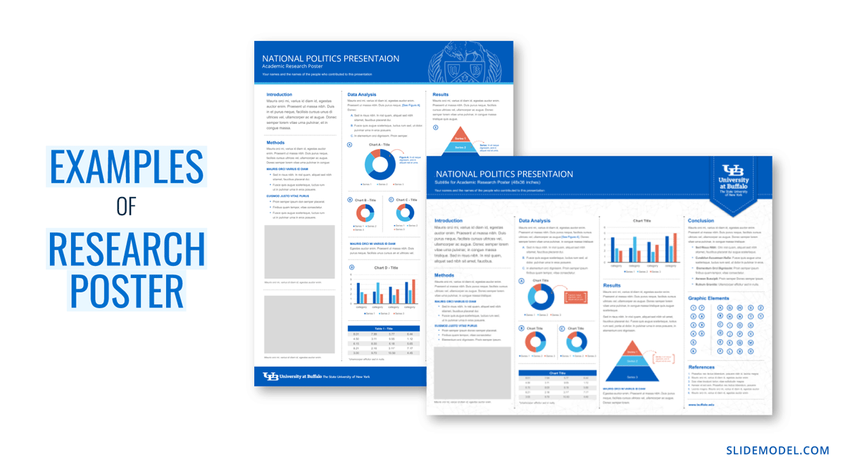
Poster Presentation Examples
Before you start creating a poster presentation, look at some examples of real research posters. Get inspired and get creative.
Research poster presentations printed and mounted on a board look like the one in the image below. The presenter stands to the side, ready to share the information with visitors as they walk up to the panels.
With more and more conferences staying virtual or hybrid, the digital poster presentation is here to stay. Take a look at examples from a poster session at the OHSU School of Medicine .
Use SlideModel templates to help you create a winning poster presentation with PowerPoint and Google Slides. These poster PPT templates will get you off on the right foot. Mix and match tables and data visualizations from other poster slide templates to create your ideal layout according to the standard guidelines.
If you need a quick method to create a presentation deck to talk about your research poster at conferences, check out our Slides AI presentation maker. A tool in which you add the topic, curate the outline, select a design, and let AI do the work for you.
1. One-pager Scientific Poster Template for PowerPoint
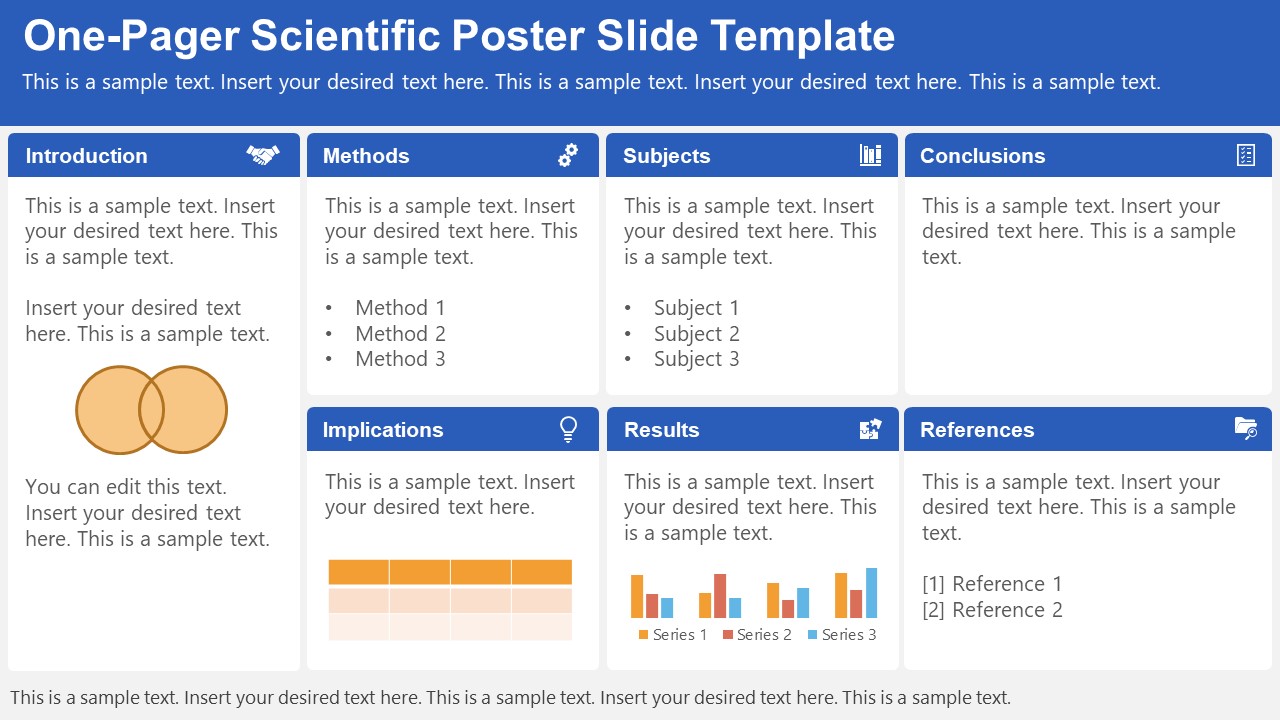
A PowerPoint template tailored to make your poster presentations an easy-to-craft process. Meet our One-Pager Scientific Poster Slide Template, entirely editable to your preferences and with ample room to accommodate graphs, data charts, and much more.
Use This Template
2. Eisenhower Matrix Slides Template for PowerPoint
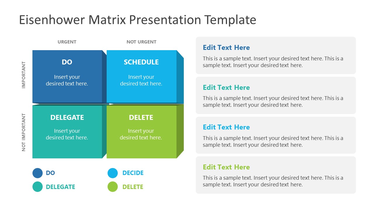
An Eisenhower Matrix is a powerful tool to represent priorities, classifying work according to urgency and importance. Presenters can use this 2×2 matrix in poster presentations to expose the effort required for the research process, as it also helps to communicate strategy planning.
3. OSMG Framework PowerPoint Template
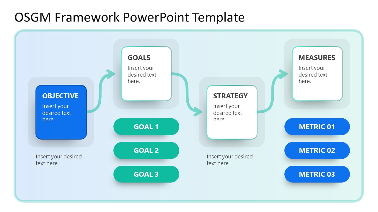
Finally, we recommend presenters check our OSMG Framework PowerPoint template, as it is an ideal tool for representing a business plan: its goals, strategies, and measures for success. Expose complex processes in a simplified manner by adding this template to your poster presentation.
Remember these three words when making your research poster presentation: develop, design, and present. These are the three main actions toward a successful poster presentation.
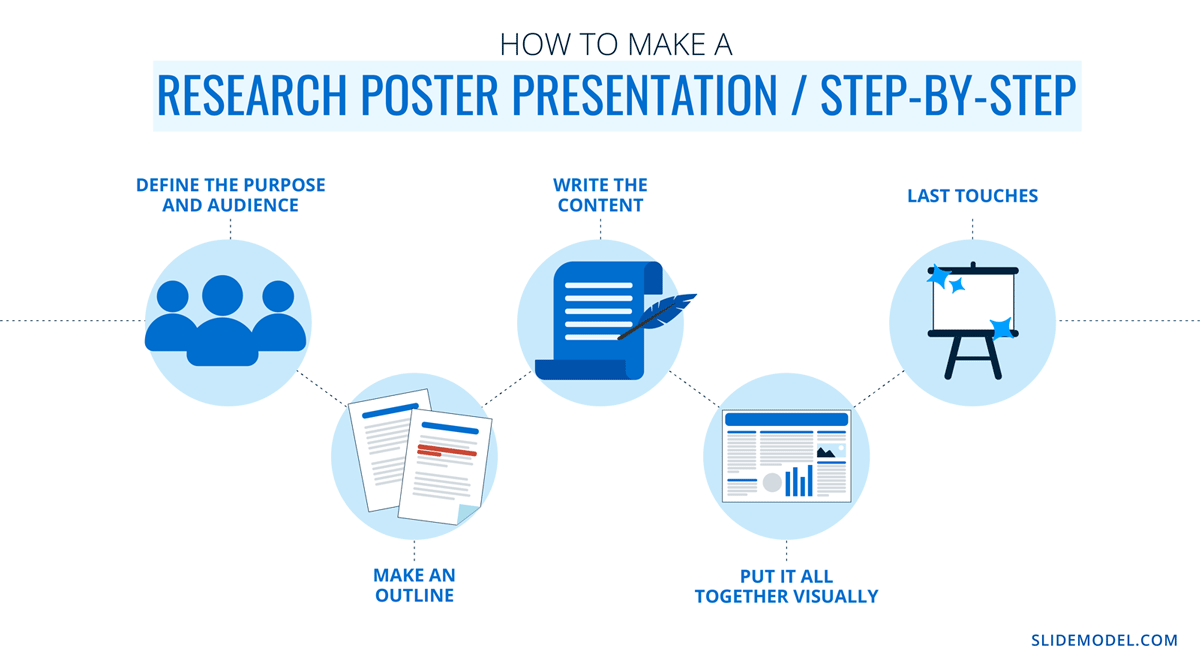
The section below will take you on a step-by-step journey to create your next poster presentation.
Step 1: Define the purpose and audience of your poster presentation
Before making a poster presentation design, you’ll need to plan first. Here are some questions to answer at this point:
- Are they in your field?
- Do they know about your research topic?
- What can they get from your research?
- Will you print it?
- Is it for a virtual conference?
Step 2: Make an outline
With a clear purpose and strategy, it’s time to collect the most important information from your research paper, analysis, or documentation. Make a content dump and then select the most interesting information. Use the content to draft an outline.
Outlines help formulate the overall structure better than going straight into designing the poster. Mimic the standard poster structure in your outline using section headlines as separators. Go further and separate the content into the columns they’ll be placed in.
Step 3: Write the content
Write or rewrite the content for the sections in your poster presentation. Use the text in your research paper as a base, but summarize it to be more succinct in what you share.
Don’t forget to write a catchy title that presents the problem and your findings in a clear way. Likewise, craft the headlines for the sections in a similar tone as the title, creating consistency in the message. Include subtle transitions between sections to help follow the flow of information in order.
Avoid copying/pasting entire sections of the research paper on which the poster is based. Opt for the storytelling approach, so the delivered message results are interesting for your audience.
Step 4: Put it all together visually
This entire guide on how to design a research poster presentation is the perfect resource to help you with this step. Follow all the tips and guidelines and have an unforgettable poster presentation.
Moving on, here’s how to design a research poster presentation with PowerPoint Templates . Open a new project and size it to the standard 48 x 36 inches. Using the outline, map out the sections on the empty canvas. Add a text box for each title, headline, and body text. Piece by piece, add the content into their corresponding text box.
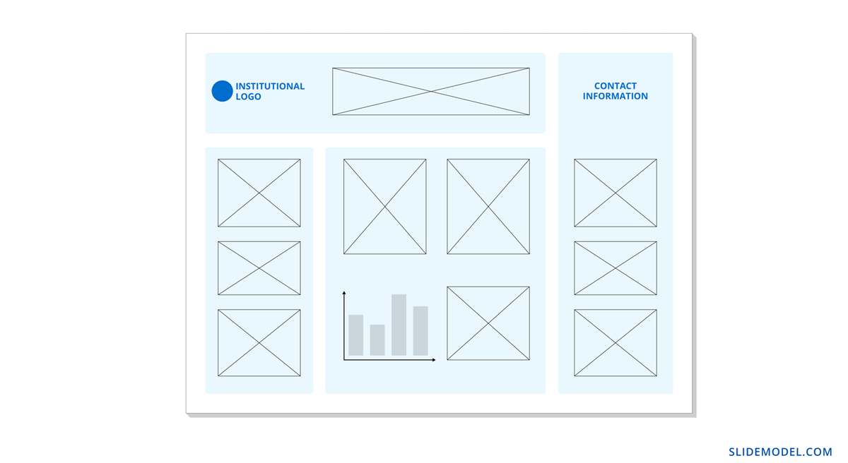
Transform the text information visually, make bullet points, and place the content in tables and timelines. Make your text visual to avoid chunky text blocks that no one will have time to read. Make sure all text sizes are coherent for all headings, body texts, image captions, etc. Double-check for spacing and text box formatting.
Next, add or create data visualizations, images, or diagrams. Align everything into columns and sections, making sure there’s no overflow. Add captions and legends to the visualizations, and check the color contrast with colleagues and friends. Ask for feedback and progress to the last step.
Step 5: Last touches
Time to check the final touches on your poster presentation design. Here’s a checklist to help finalize your research poster before sending it to printers or the virtual summit rep.
- Check the resolution of all visual elements in your poster design. Zoom to 100 or 200% to see if the images pixelate. Avoid this problem by using vector design elements and high-resolution images.
- Ensure that charts and graphs are easy to read and don’t look crowded.
- Analyze the visual hierarchy. Is there a visual flow through the title, introduction, data, and conclusion?
- Take a step back and check if it’s legible from a distance. Is there enough white space for the content to breathe?
- Does the design look inviting and interesting?
An often neglected topic arises when we need to print our designs for any exhibition purpose. Since A0 is a hard-to-manage format for most printers, these poster presentations result in heftier charges for the user. Instead, you can opt to work your design in two A1 sheets, which also becomes more manageable for transportation. Create seamless borders for the section on which the poster sheets should meet, or work with a white background.
Paper weight options should be over 200 gsm to avoid unwanted damage during the printing process due to heavy ink usage. If possible, laminate your print or stick it to photographic paper – this shall protect your work from spills.
Finally, always run a test print. Gray tints may not be printed as clearly as you see them on screen (this is due to the RGB to CMYK conversion process). Other differences can be appreciated when working with ink jet plotters vs. laser printers. Give yourself enough room to maneuver last-minute design changes.
Presenting a research poster is a big step in the poster presentation cycle. Your poster presentation might or might not be judged by faculty or peers. But knowing what judges look for will help you prepare for the design and oral presentation, regardless of whether you receive a grade for your work or if it’s business related. Likewise, the same principles apply when presenting at an in-person or virtual summit.
The opening statement
Part of presenting a research poster is welcoming the viewer to your small personal area in the sea of poster presentations. You’ll need an opening statement to pitch your research poster and get the viewers’ attention.
Draft a 2 to 3-sentence pitch that covers the most important points:
- What the research is
- Why was it conducted
- What the results say
From that opening statement, you’re ready to continue with the oral presentation for the benefit of your attendees.
The oral presentation
During the oral presentation, share the information on the poster while conversing with the interested public. Practice many times before the event. Structure the oral presentation as conversation points, and use the poster’s visual flow as support. Make eye contact with your audience as you speak, but don’t make them uncomfortable.
Pro Tip: In a conference or summit, if people show up to your poster area after you’ve started presenting it to another group, finish and then address the new visitors.
QA Sessions
When you’ve finished the oral presentation, offer the audience a chance to ask questions. You can tell them before starting the presentation that you’ll be holding a QA session at the end. Doing so will prevent interruptions as you’re speaking.
If presenting to one or two people, be flexible and answer questions as you review all the sections on your poster.
Supplemental Material
If your audience is interested in learning more, you can offer another content type, further imprinting the information in their minds. Some ideas include; printed copies of your research paper, links to a website, a digital experience of your poster, a thesis PDF, or data spreadsheets.
Your audience will want to contact you for further conversations; include contact details in your supplemental material. If you don’t offer anything else, at least have business cards.
Even though conferences have changed, the research poster’s importance hasn’t diminished. Now, instead of simply creating a printed poster presentation, you can also make it for digital platforms. The final output will depend on the conference and its requirements.
This guide covered all the essential information you need to know for creating impactful poster presentations, from design, structure and layout tips to oral presentation techniques to engage your audience better .
Before your next poster session, bookmark and review this guide to help you design a winning poster presentation every time.
Like this article? Please share
Cool Presentation Ideas, Design, Design Inspiration Filed under Design
Related Articles
Filed under Google Slides Tutorials • September 30th, 2024
How to Draw on Google Slides
Learn how to make drawings or hand-drawn annotations in your presentations by mastering drawing on Google Slides.
Filed under PowerPoint Tutorials • September 17th, 2024
How to Work with Slide Master in PowerPoint
Create design changes across your slide deck by learning how to work with Slide Master in PowerPoint.
Filed under Google Slides Tutorials • September 13th, 2024
How to Wrap Text in Google Slides
Text and images don’t need to dispute design decisions in Google Slides. Learn how to wrap text in Google Slides with this guide.
Leave a Reply
Want to create or adapt books like this? Learn more about how Pressbooks supports open publishing practices.
Scientific Posters
Characteristics of a scientific poster.
- Organized, clean, simple design.
- Focused on one specific research topic that can be explained in 5-15 minutes.
- Contains a Title, Authors, Abstract, Introduction, Materials & Methods, Results, Discussion, References and Acknowledgements.
- Has four to ten high-resolution figures and/or tables that describe the research in detail.
- Contains minimal text, with figures and tables being the main focus.
Scientific Poster
A scientific poster ( Fig.1 ) is an illustrated summary of research that scientists and engineers use to present their scientific discoveries to larger audiences. A typical poster is printed on paper with dimensions of 36-inches (height) by 48-inches (width).
Figure 1. Scientific Poster
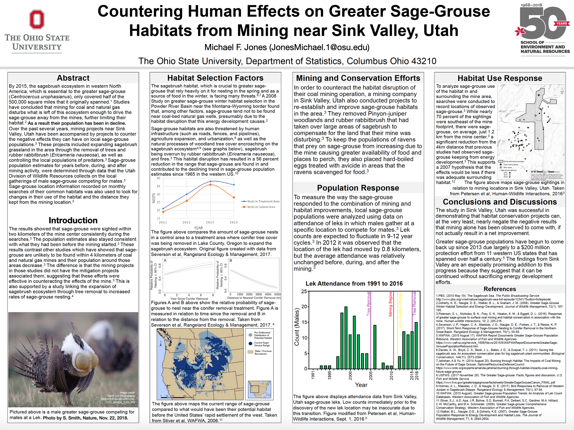
Posters are displayed at events such as symposiums, conferences and meetings to show new discoveries, new results and new information to scientists and engineers from different fields. A large event can have hundreds of posters on display at one time with scientists and engineers standing beside their individual posters to showcase their research. A typical interaction between a poster presenter and an audience member will last 5-15 minutes.
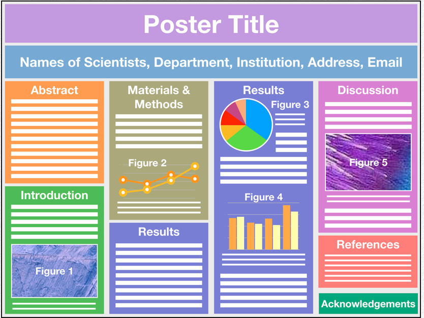
Scientific posters are organized systematically into the following parts (or sections): Title, Authors, Abstract, Introduction, Materials and Methods, Results, Discussion, Acknowledgments and References ( Table 1 and Fig. 2 ). Organizing a poster in this manner allows the reader to quickly comprehend the major points of the research and to understand the significance of the work.
Table 1. Characteristics of a Scientific Poster
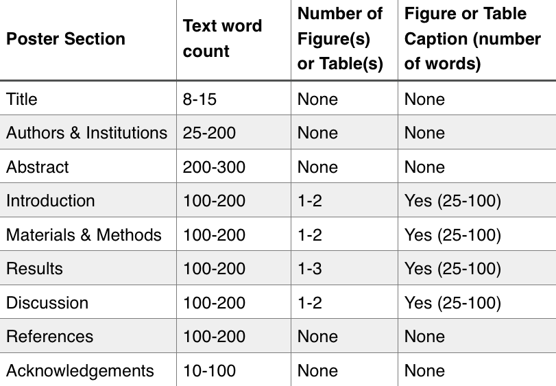
The most important parts of a scientific poster will likely be its figures and/or tables because these are what an audience will naturally focus their attention on. The phrase “a picture is worth a thousand words” is certainly true for scientific posters, and so it is very important for the poster’s author(s) to create informative figures that a reader can understand. The “ideal” figure can be challenging to create. Providing too much information in a figure will only serve to confuse the reader (or audience). Provide too little information and the reader will be left with an incomplete understanding of the research. Both situations should be avoided because they prevent a scientist from effectively communicating with their audience.
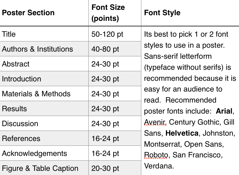
Authors use different sizes of font for their poster text ( Table 2 ). The general rule is to use a font size that can be read from a distance of 3-feet (1 meter), which is the approximate distance that a person will stand when viewing a poster. The largest fonts (e.g., 40-120 point font) will be used for the title, author list and institutions. Section headings will use 30-40 point font. Section text, table captions, figure captions and references will typically use 20-30 point font. Font sizes smaller than about 20-points can be difficult for an audience to read and should only be used for the References and Acknowledgements sections ( Table 2 ).
Table 2. Poster Font Size and Style
A poster abstract contains all text (no figures, no tables) and appears at the beginning of the poster ( Fig. 2 ). An abstract is one paragraph containing 200-300 words in length. The Introduction section ( Fig. 2 ) appears after the abstract and typically contains 100-200 words of text, a figure(s) and/or table(s) and a caption for each figure and table consisting of 25-100 words for each caption. The Material and Methods sections ( Fig. 2 ) appears third and consists of 100-200 words of text, a figure(s) and/or table(s) and a caption for each figure and table consisting of 25-100 words for each caption. This is followed by the Results section and Discussion section ( Fig. 2 ). Each of these sections contain 100-200 words of text, a figure(s) and/or table(s) and a caption for each figure and table consisting of 25-100 words for each caption. Sometimes these two parts of a poster are combined into one large section titled Results and Discussion. Some posters contain a Conclusion section, which follows the Discussion section. The example shown is Figure 2 does not contain a Conclusion section. The final parts of a poster are the References and Acknowledgements sections ( Fig. 2 ).
Figure 2. Parts of a Scientific Poster
An audience will focus most of their attention on the poster title, abstract, figures and tables. Therefore, it is important to pay particular attention to these parts of a poster. A general rule is that less text is best and a figure is worth a thousand words. The text contained within a poster should be reserved for the most important information that a presenter wants to convey to their audience. The rest of the information will be communicated to the audience verbally by the scientist during their presentation.
Its very important for a scientist to thoroughly understand all the data and information contained within their poster so that they can effectively communicate the research to an audience both verbally (i.e., during their presentation) and visually (i.e., using the figures and tables contained within the poster). It is also important that the References section of a poster contains a thorough summary of all publications pertinent to the research presented in the poster. This way, if an audience member wants more information on a particular topic (e.g., instrument, technique, method, study site) the presenter can direct the audience to the publication(s) where more information can be found.
Scientific Posters: A Learner's Guide Copyright © 2020 by Ella Weaver; Kylienne A. Shaul; Henry Griffy; and Brian H. Lower is licensed under a Creative Commons Attribution-NonCommercial 4.0 International License , except where otherwise noted.

Share This Book
+31 (0)6 5465 1346 | [email protected]
CAUSE AN EFFECT
Blog on science communication
How to design a poster presentation that makes your research stand out

Have you submitted an abstract for a conference poster? Great! It can be an amazing opportunity to get valuable feedback, advance your career, and make lasting connections. But let’s face it: most conference posters are crammed with too much text, unclear graphs, and are difficult to understand. Don’t worry, we’re here to help. This is a step-by-step practical guide to help you create a poster that’s so good, that people actually stop to read it, start a conversation and even remember your poster years later.
This blog is based on our extensive Poster Design Guidelines , where we’ve visualized all the tips in six posters.
Define the true goal of your poster presentation
When we ask researchers why they’re presenting a poster, the typical response is, “I want to share my research.” Fair enough, but let’s be honest: if sharing your research was the only goal, there are much easier ways to do it. You could submit a summary in the conference booklet, email your paper to colleagues, or put it on social media.
Poster sessions are social events. The main goal is to network and connect with other researchers.
But here’s the thing—a poster session isn’t just about showing off your data. It’s your chance to dive into conversations, make new connections, and get instant feedback. In fact, it’s a social event! While sharing your results is important, the primary goal of a poster session is to connect with others.
What is your personal goal for the poster session?
Beyond that, you can also set personal goals. What do you want to get out of the poster session? How can you use this opportunity to advance your research, get answers to pressing technical questions, make an impact, or learn from others in your field?
Don’t just create a poster because you have to, this is your moment to define what you want to achieve with it. Here are some ideas for personal goals to inspire you:
- Get valuable feedback on your research. Receive tips on improving your methodology, avoiding pitfalls in your dataset, or addressing issues with participants. Constructive criticism and suggestions from others can be incredibly beneficial for refining your work.
- Connect with key figures in your field. Networking with (influential) people can advance your career. They might even point you toward a great post-doc position or other opportunities.
- Find potential collaborators. Meet researchers who can join forces with you on your project. Sometimes, the missing piece is just the right team or a fresh perspective.
- Share and promote best practices. Whether you’ve developed a new methodology or discovered flaws in existing treatments, use your poster to recommend better practices or warn others of potential mistakes. Think about ways that you can help others in their work.
- Test new research ideas. Are you considering a new research direction? Use the poster session to gauge interest and gather feedback before diving in. This can help you refine your ideas before committing significant time and resources.
- Influence funding decisions. Funders and grant reviewers often attend conferences. A compelling poster can catch their eye and improve your chances of securing funding for future projects.
Use these ideas to make the poster session work for you and then design your poster to help you achieve it.
Idea: Gather valuable feedback through your poster

Viviam attended our poster design workshop in Norway and was struggling with significant challenges in her PhD. She decided that her personal goal for her poster was to gather as much feedback as possible. To achieve this, she designed her poster around these roadblocks, and asked visitors to stick post-it notes with their tips and advice on the poster board. This approach not only provided her with valuable input but also earned her two poster awards!
“It was an amazing experience and the outcome was exactly what I wanted, a lot of interaction with the public, feedback, questions, many post-it notes, lots of connections in LinkedIn and possibly new collaborations. Also, my supervisors are extremely proud and happy. I couldn’t ask for more! THANK YOU!”
See her poster in our Hall of Fame .
Read more about the goal of your poster and writing a pitch in our blog Define the goal & pitch for your poster presentation
The essential elements of a poster
Before diving into the design, let’s make sure you’re including everything a good poster needs. Remember that your poster is a summary of your most important research results, so keep it short and to the point. If visitors want to learn more about the details, they can read (a printout of) your paper or start a conversation.
- Title: Your title is your first impression and the one thing people will remember, so make it count! It should be big, clear, concise, and ideally communicate your main message or conclusion. Avoid jargon and abbreviations unless you’re confident that your audience will get it.
- Context: Provide a brief background or context to orient your viewers or explain why your research is important. Keep this section short, a single sentence is often enough.
- Study details: A quick overview of your study design (e.g., type of study, number of participants, duration, intervention, outcome measure, etc). This is essential, but not the most exciting part, so stick to the essentials.
- Evidence (data) : The evidence for your main message statement. This can be a graph or even a written description of your main results. Don’t fall into the trap of including every graph and making them so small that nobody can read them.
- Visuals: We often include a large visual to draw attention to the topic or main result. This could be an illustration, picture, or diagram from your research result. You get the most effect if this is a large image that can be seen from across the room.
- Call-to-action: What do you want your audience to when they visit your poster? Give feedback on how to improve your work? Connect with you on LinkedIn? Have a fruitful discussion? Visit your website? Contact you for more details? Get the most out of your poster and tell people how they can help you.
- Contact details: Include your full name, affiliation, and contact details. Make sure people can reach out if they’re interested in your work or want to connect. You can usually leave out departments and author degrees. I can be nice to include a photo of yourself. This way people can recognize who presents the poster when you’re not standing next to it, and walk up to you later.
- References : If your poster is based on a published paper, you may include a reference. However, keep it short (you don’t have to include all authors) and use a small font size. This way, your audience can find the paper, without it taking up too much space or attention.
- Add sections for extra interaction and your personal goal : Include a section to highlight important elements of your research with a title like “What’s new”. Or add a highlighted box with “Give feedback”, or “How can you help?” to encourage visitors to talk to you. Starting a conversation can be intimidating for visitors too, so these sections can also give them a starting point for a discussion.
QR code or not?
If you have additional materials or want to make it easy for people to find your LinkedIn page, you can consider adding a QR code to your poster. It can link to your full paper, other references, a video explanation, or any other online resource that complements your poster. However, keep the limitations of QR codes in mind. People might not have a phone that can scan a QR code, forgot their phone or have low phone battery. And most importantly: you probably don’t want people to stare at their phone in the middle of an engaging conversation.
If you decide to add a QR code, make sure you:
- Clearly explain where the link leads to , and write down what people can find there. e.g. “Download my full paper”, “Watch the video about my methods”, “Connect with me on LinkedIn”. Or a combination of these: “Connect with me on LinkedIn to get my paper”.
- Always provide an alternative , like a short URL so you don’t rely on the code, and show people where it leads. It’s also wise to have a pen and paper handy to jot down someone’s email address or name, just in case technology fails.
- Design the QR code with a tool like QRcodemonkey , where you can customize the color, pattern, and add an icon to match your poster’s style. And remember to remove the ugly white background.
Check out part 1 of our Poster Guideline about the essential elements of a poster:

The most important thing first: write a title that captures your main message
Now that you know the essential elements to include on your poster, let’s dive in to some of the elements to make them great. We start by focusing on the most crucial part—your title. Your title is often the first thing people read: it should capture attention and communicate your main message.
Don’t write vague descriptive titles!
Whatever you do, resist the urge to just slap the title of your paper onto your poster. Descriptive titles are used in almost all peer-reviewed papers, but for posters they are terrible: they don’t give any information about the main conclusion, and only tell us about the topic you’re researching.
Let’s have a look at this generic descriptive title from this article on air pollution as an example:
“ Urban Air Pollution and Greenness in Relation to Public Health ”.
When we read it, we still don’t know anything! And at the same time it raises all these questions: “Is there a relation?”, “Is less pollution related to greenness?”, “Does this paper answer how we can reduce pollution?”.
When you write a title like this, you’re delaying communication of the main message, which will frustrate your audience. Imagine if every newspaper headline was that vague—no one would bother reading past the first line.
The one thing all the people at a poster session are looking for is your main message . That’s why you want your main message to be the first thing people read. And that’s usually your title, since it’s big and bold and catches the most attention.
Think about the one thing you want people to remember after they’ve seen your poster. That’s your title.
When creating your title, think about the one thing you want people to remember after they’ve seen your poster. That’s your main message, and it should be front and center. Most of the time, your main message is your research conclusion, but it doesn’t have to be. It could be a recommendation, a warning, or promoting a new research method that’s more effective than the old ones.
Conclusive title are better than descriptive ones
The best titles don’t just hint at your research—they spell it out. A conclusive title ensures that even if someone only reads your title and nothing else, they’ve still walked away with your key message. And that’s a win in communication!
Let’s compare the following titles, and see which one tells you more useful information about the study:
Descriptive title : Urban Air Pollution and Greenness in Relation to Public Health.
Conclusive title : Expanding green spaces and enforcing low-carbon policies can effectively combat health risks from air pollution in Addis Ababa.
Write a conclusive title, so people can read your main message at a glance!
If you’re struggling to write a conclusive statement, or if your results aren’t finalized yet, consider writing your title as a question. A title question does not tell the whole story but it might make people curious enough to walk up to your poster to find out the answer or have a discussion with you. What about “Mental health in hospitals: what can health professionals do to ease the pain?”. It’s the perfect start to a conversation. Think about the first question that you would ask a person approaching you, that can be your title.
TIP: Does your research show negative results? Shout it from the rooftops! Don’t be disappointed, your research is just as important as anyone else’s. Do not hide it, show it, so other people can learn from it.
For more examples and tips on how to formulate your title, read our blog Write a compelling title about your research . Learn why descriptive titles are the worst for good science communication and try out different main messages to see which one works best for your research.
Write headings to tell a story
To be an effective science communication tool, your poster needs to be easy to scan. At a conference, most people will glance at your poster, spend a few seconds reading the title and maybe some bold headings, and then decide whether to stop and talk or move on.
If your main headings are the traditional Introduction, Methods, Results, Discussion, and Conclusion, then you’re missing a chance to communicate your message quickly. Those headings won’t tell your audience anything new, and they’ll delay getting your main point across.
Your goal should be for everyone to quickly grasp your entire research story without squinting at that tiny 12pt paragraph text. So, let’s dive into how to rewrite your headings to tell your story clearly and concisely:
Turn your lengthy introduction into a sentence for context
Start with a single, punchy sentence that gives context for your research. Forget the long paragraphs about why you’re doing this work—most people at the conference already know the big issues in your field (everyone’s out to cure cancer or save the planet, right?). Instead, summarize the core issue or background of your study in a single sentence. For example:
- T-cell therapy works very well for ‘liquid cancers’ such as leukemia, but is much less effective for solid tumors.
- Crucian carp can survive in ice-covered lakes without oxygen for months. We want to know if DNA methylation acts as a switch to transition from summer to winter months.
Turn your headings into sentences
With that context in place, keep the momentum going by writing conclusive statements for each of your headings. These sentences become the bold, eye-catching headings on your poster—the “chapters” of your story. This way, anyone can quickly scan your poster and immediately grasp the main message of your research.
Once you’ve set the stage with a brief context, continue with this to write a conclusive statement for each of your headings. These sentences become the bold headings on your poster, effectively turning them into the “chapters” of your story. This way, your audience can quickly scan the headings and immediately grasp the main message of your research.
For instance, instead of vague headings like “ Introduction ” or even the slightly better “ Costs of diabetes ,” go for something more informative like: “ Total costs of diabetes have increased to $245 billion .” This gives much more information at a glance.
People scan your poster, so turn your headings into a compelling story.
In our workshops, we encourage participants to start by writing their research in a single paragraph or a one-minute speech. Then, trim it down to just a few sentences. Those sentences will become your poster headings (think of them as the chapters of your story). This way, your audience doesn’t have to dig through paragraphs to find the key points—they can simply scan the bold headings and immediately understand your research.
If you’re afraid your supervisor is not going to like this departure from the traditional academic structure, you can keep those familiar headings as smaller, lighter eyebrow headings. This way you satisfy the more traditional academics while still making your main message stand out. (Learn more about eyebrow headings and text design in part 3 of our Poster Guidelines .)
Which behavioral and nutritional factors are targets for stomach cancer prevention programmes?
A meta-analysis and systematic review of 14 behavioral and nutritional factors in 52,916 studies.
Helicobacter pylori infection, smoking, alcohol, high salt intake were identified as the main factors contributing to stomach cancer.
These results may be utilized for ranking and prioritizing preventable risk factors to implement effective prevention programs.
Learn how you can write an engaging research story for your poster in our blog How to write a story from your research for posters & infographics .
Example of a story-based poster
Let’s have a look at this example poster we created from a paper on microbes in the Antarctic. Instead of sticking to dry, traditional headings, we transformed each section—Introduction, Methods, Results, Conclusion—into a conclusive statement that tells the story of the research. This makes it easy to scan. You can add more details in the paragraph text or graphs under each section. But don’t overcrowd your poster with details. If people want more information, it’s better to discuss these details or hand out your actual peer-reviewed journal article. The more information you give, the less people will remember.

Design your poster like a professional
How do you think you will come across if you use different backgrounds, colors and fonts for every section? Does that really make you look creative and professional? We know it’s tempting, but don’t use every tool PowerPoint has given you to design with. Don’t use gradients, drop-shadows, text effects if you don’t know how to use them.
The design of your poster should support your story, provide structure, and make your presentation more effective. Design can also help distinguish between the main message and supporting information. By using different designs for your main thread and quotes, anecdotes, or examples you make sure people don’t lose sight of your most important messages.
We love to show bad examples, so check out this poster presentation dissection:

Get inspired by creative posters in our Poster Hall of Fame
We’re so proud of our workshops participants when they create a beautiful poster or win a poster award! So we created a hall of fame to showcase great posters. As you will see, there is no one standard, you can create any type of poster and still attract attention. Each poster is made under different circumstances and conference requirements.
Design your texts to make them easier to read
Since text is often the bulk of your poster, let’s see how we can design it better to help your audience understand it better.
- Write in simple and active language . Write “We analyzed the data” instead of “The data was analyzed”. Active text is more engaging and understandable, so avoid passive sentences as much as possible. TIP: Write as if you’re talking to your visitor and read your text out loud to see if it makes sense.
- Keep sentences short . Sentences should be short and to the point. Keep most sentences to a maximum of 14 words if possible. Paragraphs are no longer than 35 words, or 5 lines.
- Write full sentences . Writing short sentences doesn’t mean you should remove important words (and make it impossible to understand). Every sentence should contain a subject and a verb (yes, this includes bullet-points and titles). Without those, they miss essential information.
- Font size: Your main title should be bold and easy to read, between 100 and 150 points . If your title is too long, split it up with a short bold main title, and a smaller subtitle with more nuance or details. Section headings should be bold and between 60 and 80 points . The text of your headings should include important information (and not just introduction, methods, results). The paragraph text of your poster should be between 30 – 40 point size. Viewers should be able to read it from a few steps away. Details and references can be smaller, but don’t go below 24 point size.
- Align left : Unless you have a very good reason, left-align your titles, sentences, bullet-points, and paragraphs. Centering or justifying text slows down reading time and is not considered good practice for accessibility.
- Highlight: If you cannot make paragraphs shorter, you can highlight important sentences in bold to make them stand out.
- Make it legible : All your text should be legible and easy to read. So keep uppercase to a minimum (we reserve it for eyebrow headings). And don’t underline text unless it’s a hyperlink in a digital version of your poster.
Only use bullet points for actual lists
If there is one piece of advice we would love for you to remember from this post: do NOT use bullet points for sentences! It transforms them into weird short sentences and doesn’t make your messages any clearer. Please, only use bullet points for actual lists. Like countries, study details, or different outcomes you are measuring. Disregard your instinct to put bullets before sentences and just write a nice readable paragraph instead. People will love you for it!
Check out part 3 of our Poster Guideline for tips on structure, and writing texts:

Font size guidelines, a poster
We like to create posters about posters. So check out this A1 poster that shows the best practices for legible fonts on your poster:

Use images and icons, but make sure they’re effective
Text alone can be a bit uninspiring sometimes. We encourage the use of images but make sure they contribute to your message. Either use them to show which topic you are researching (e.g. plane aerodynamics, body fat distribution, or the history of women’s rights), or when they have intrinsic value and show something that you cannot point out in words (e.g. the location of an aorta stent, or the flow of information between low-orbit satellites). Don’t add cute images of people, landscapes, university buildings or flower patterns to spice up your poster.
So please don’t use random useless stock photo’s like these in your presentation! #facepalm

Images aren’t just there to make your poster pretty—they’re there to attract attention and help people understand your message. Here’s how to use images effectively:
- Draw attention with a large visual that shows your topic or supports your main message. Make sure it reflects your personality, this will make it more memorable for people (and make it more fun for conference attendees to browse posters).
- Use high-quality images: Use clear, high-resolution images. Blurry visuals scream amateur and can distract from your message. If you need to, remove the white background from images and graphs in PowerPoint or go to remove.bg .
- Icons: Use meaningful icons that help your audience scan your poster quickly. Realize that a lot of people will not have the same idea of what an icon means, so avoid using vague icons for vague concepts like process or implementation . And always add text to an icon.
- Don’t decorate, educate: Leave out fun, cliché, or decorative visuals that distract from your main message. Choose visuals that enhance the content and are easy to understand at a glance. They should be directly relevant to your study and should not require extensive explanation.
- Be consistent: Create a consistent professional design by picking icons in the same style (e.g. choose between line icons and solid icons) and do not combine illustrations and images from different styles (line-drawings, 3D design, or photographs).
- Be inclusive & avoid stereotypes . Think about it: Do the elderly all use canes? Is your population all white and able? Are all human shapes male? We encourage you to acknowledge diversity and use appropriate descriptions, including those for gender, sexual orientation, racial and ethnic identity, disabilities, and age.
Don’t use Google to find images (these are usually copyright protected). Instead, check out these websites for great images:
- pexels.com (stock images & videos)
- unsplash.com (stock images)
- Phosphor icons (general icons)
- bioicons.com (biology & medicine icons)
- scidraw.io (lab research icons)
For a huge collection of useful websites where you can find images, illustrations and icons, check out our blog Our favorite (free) tools to create better designs for science communication
Visualize your data clearly and effectively
Data is the heart of your research, but it needs to be presented in a way that’s easy to digest. Here’s how to nail your data visualization:
- Save space by visualizing only the most important results from your research that support your main message and give evidence for your conclusion. One or two graphs is enough. There is usually no need to include diagrams, tables, or graphs in your introduction or methods section.
- Create graphs instead of tables to make it easier to see trends and compare data. Graphs and other data visualizations help your audience see patterns in the data and allow them to quickly compare data points. Tables take too much time to understand in the limited time you have to make your point.
- Give the conclusion from your graph in the title above it (instead of a descriptive title), and highlight the data that support your main conclusion. Which title do you think is better? Projected disease prevalence and mortality reduction over 20 years for the population aged 18 to 95 years in nine European countries with lower salt intake. OR Lower salt intake reduced the prevalence of stroke in Poland by 13.5% . You can even write sentences inside graphs to clarify certain data.
- Use direct labels instead of legends, adding your data labels right next to the graph lines (instead of further away) makes it easier to understand your data.
- Tell a story . Show people where the interesting data is hiding in a graph and tell a story. Do this by highlighting the data that supports your main conclusion and writing short explanations to tell people what it means.
- Simplify your graphs: Keep your graphs simple and easy to read. Remove anything that does not help people understand your data like (grid) lines, borders, and (white) backgrounds.
Check out part 4 of our Poster Guideline for tips on datavisualization.

Choose and apply colors wisely in your design
Color can make your poster stand out from a sea of boring light blue posters, but too many colors can turn it into a visual assault. Here’s how to use color wisely:
- Be intentional . Don’t just use colors randomly because it’s ‘pretty’. Think about their purpose. Do you want to highlight and draw attention? Do you need colors to show differences between items? If there is no reason to use different colors for clarity, don’t do it.
- Use a simple color scheme: Stick to a maximum of two colors to create a cohesive look. If you’re having trouble choosing colors, use a single accent color with black, white, and grey. Using shades of a single color is often a better idea than using multiple bright colors. The darkest color will draw the most attention, so use it to create visual hierarchy. Use an online shade generator tool like shadegenerator.com .
- Avoid color coding. Don’t use five colors for different datasets in a graph, or make each section a different color. It can be hard for people to distinguish between colors, and they might assume the colors have specific meanings. Plus, with color-blind visitors in mind, it’s essential to make your point clear without depending on color alone.
- Contrast: Make sure there’s enough contrast between your background and text. Use a contrast checker to make sure the contrast is at least 4.5 (the minimum for accessibility). This improves readability and helps important information stand out.
- Draw attention : Color is a great way to draw attention to a part of your poster that contains important information. But don’t do this more than one or two times. If you highlight everything, nothing stands out.
- Re-use colors for a professional look. See if you can re-use colors from images elsewhere to make the design look professional. You can use the eyedropper tool in PowerPoint or browser extensions like ColorZilla to pick the color code (HEX or RGB) from any image.
There are many tools and articles to help you pick the right colors. Learn from their expertise:
- blog.datawrapper.de/beautifulcolors/
- learnui.design/tools/data-color-picker.html
- chartio.com/learn/charts/how-to-choose-colors-data-visualization/
Check out part 5 of our Poster Guideline for tips on the use of colors.

Achieve balance and symmetry in your poster design
A well-balanced poster is a joy to look at. Here’s how to achieve that perfect balance:
- Reading direction. Give clues on how to read your design. The standard reading patterns (in the English-speaking world) are the F and Z-pattern, so when in doubt, stick to the top-to-bottom and left-to-right patterns. If your design is more complex, add arrows to indicate the reading order.
- Balance all the elements on your poster by aligning them to each other and apply the same amount of spacing between and around (text) boxes. You can choose to align the text inside a box with other elements, or you can align the box itself with the other elements (see the visual examples in part X of our poster guideline).
- Be consistent and apply the same styles to elements like boxes, lines, text, icons and images.
- Margins and spacing: Use margins to frame your content. Don’t take text all the way to the edges of a text box—give it some breathing room.
- White Space: Don’t be afraid of white space. It’s not empty—it’s strategic. It gives your design room to breathe and makes the content more digestible.
Prepare for a conversation
Don’t just prepare your pitch, also think of what you want to say when someone approaches your poster. Or better yet, what you want to ask them. It’s an opportunity to learn something yourself. It also helps to reduce your nerves if it’s your first time (or if it’s just not your cup of tea to talk to dozens of strangers).
Also think about what critical questions people may have about your poster and prepare a short answer. Is your research about the benefits of cheese and it is funded by the dairy industry? Expect some critical questions. Be grateful you get these questions, it’s what proper scientific discussion is all about!
Do not conform to the (invisible) design standards set by other academics!
That other people are cramming graphs and text into their poster is not your problem. You don’t have to copy them. Do all posters need to be blue on white and have hundreds of bullet-points? The reason why so many academic posters are badly designed is because everybody is copying everyone else. And since almost nobody has followed a design or science communication course, they just do what everyone else does: copy their paper to a poster.
Institution templates
Institution templates are another hurdle to tackle. Maybe you have to abide by a standard template from your institution, or add huge logos from every single collaborator (and even pictures of their locations!) on it. We advise that you do NOT give in to these demands without a fight. Remember: these guidelines are not made by science communication experts, but often by the press officer with a desire for a uniform look, or by more senior scientists who think design is something achieved by rainbow-colored text effects in Word. You get our frustration…
Of course, it’s good to adhere to the physical format of the poster mount and have large and legible text, but we’ll try to push you out of your comfort zone here a bit. You will not get punished by anyone for using different colors than your institution, use a more legible font size, and use design in a way that makes your research pop. Remember: you can not stand out if your poster looks like all the other boring posters in the room!

An ugly template well done
Leonardo came to our workshop to design a poster for a conference that uses a specific template. It was a very ugly template with a brown gradient and a large conference logo and title. Since we could not change any of that, we advized to go all-in with the template colors. So we used the same browns as the header and made sure it was easy on the eyes.
With this poster Leonardo even won the best poster award! This shows that even with badly designed template you can still create a good poster if you apply all the design tips.
Conference guidelines
Conference guidelines are not all bad. We were surprised to learn that a lot of conferences actually want you to create something beautiful! Here’s a selection of some tips international conference organizers gave on their websites that we fully agree with:
- Avoid overcrowding figures and cramming too many numbers into tables.
- Avoid long text paragraphs and try to be clear and concise.
- Remember to keep illustrated and written material simple.
- Include your email address so that attendees can follow up with you on any questions related to your poster presentation.
- Add pictures describing your idea.
- Some text to present the main contributions and the achieved results.
Use handouts for the details of your study
There is a fear among PhD students that someone will come up to their poster and dislike it because it’s missing a specific detail. We get it, doing your first poster presentation can be terrifying. But remember, your poster is not the only source of information, you are! You’ll be there, ready to fill in any details that didn’t make it onto the poster.
If this doesn’t ease your mind, print out the (preliminary) paper or additional details not included on your poster, and keep them handy. Chances are, nobody will ask for them, but just having them around might give you peace of mind.
However, you might end up with 20 printed copies and no one to give them to. Plus, let’s be honest—how often do people actually read all the handouts they collect when they get home? Instead of focusing on the details, think about how you can make a lasting connection.
We think that making connections is more important than sharing all the details of your research right then and there. So instead, give out your LinkedIn or ResearchGate details, or your personal website URL, so you are instantly connected and they will see any new updates you post in their timeline. If they are still interested in the details, you have their contact information to send them your paper when it’s published!
Get creative
Do you want to stand out? Bring a prop related to your research to the stand. Do you research fat cells? Bring a pound of lard with you (in a sealed bag please). Do you research tooth health? Bring a plastic jaw with you that people can touch. This will ensure that people visit your poster and can be a fun way to meet new people.
Bring post-it notes for people to write tips and feedback on. Or laminate your poster and give people a whiteboard marker to write things on it or highlight sections they think are important. This is not only a nice gimmick that people will remember, but can be good for you as a reminder of the feedback you were given. As an added bonus it gives visitors a chance to interact with each other.
A template to get you started
Want to get a head-start on designing your poster? We’ve developed a simple template for your poster to get you ahead of the curve. But don’t take this template too seriously! In fact, we usually advise against using templates; if everybody starts using them to create the exact same poster, nobody will stand out. It’s your job to make it interesting and fit your needs and limitations.

Poster design checklist
Use the good design checklist from our workshops after you finished the design. If you tick all the boxes, you can be confident that you have created a good poster:
- Is the main message clear at first glance?
- Is there a clear hierarchy in the design?
- Are important points properly emphasized ?
- Is the reading direction clearly indicated?
- Are the texts and visuals easy to understand without extra explanation?
- Does every sentence have a verb?
- Is the meaning of the arrows clear?
- Do all images , icons , and illustrations have a purpose?
- Is the design balanced and consistent in terms of style and color?
- Is the design accessible and inclusive?

Submit your award-winning poster design and inspire others

Are you proud of your poster design? Did it win an award, or do you think it could inspire others? We’re on the lookout for well-designed, original posters to showcase how effective and beautiful poster presentations can be in our hall of fame .
We’d love to feature your work and help inspire the scientific community! Send us your best poster design as a PDF or PPT, along with your name and LinkedIn profile, to [email protected] . Feel free to include a short quote about the feedback and discussions your poster generated, and how you felt presenting it. Your work might be featured, helping others create impactful posters too!
Learn more in our hands-on workshops
Want to learn more about how to create amazing posters? Check out our workshop on Poster presentation & Infographic design .
Are you’re a university communication officer or conference organiser, get in touch to learn about our webinars so we can train your researchers to present their work better.

About the Author: Liesbeth Smit
Search for more scicomm tips:, read more about science communication:.

Write a compelling title about your research

How to write a story from your research: structure for posters & infographics
Tool to create your own data visualisation with icons

Increase the visibility of your research project website and reach your target audience

Find inspiration for your design & create a unique style for your research website

Define the goal & pitch for your poster presentation
Become a pro science communicator with our workshops.

Impact through creative science communication
Do you want to have a positive effect on the world? We'll make you think about your goal, audience, and message and ensure you know what it takes to create impact! Also available as a keynote lecture.

Basics of science communication, pitch your research to any audience
By understanding your audience and aligning your message to their needs, you can really get your point across. In this workshop you’ll create a short pitch or article to practice just that.

Design effective posters, graphical abstracts & infographics about your research
Create beautiful and effective infographics, posters and graphical abstracts. You will learn the best practices in design to make sure your work gets noticed and is easier to understand.

Science and journalism: how to pursue and navigate media attention
Do you want to be more confident around journalists or the media? Or do you want to take advantage of the opportunities that social media offer for scientists? We'll get you started!
Contact us to find out what we can do for you!
In English or Dutch
Call Liesbeth: +31 (0)6 5465 1346
Call Stephan: +31 (0)6 245 92 770
Working around the world from the Netherlands Pricing General Terms and Conditions Algemene Voorwaarden Privacy & Cookies

IMAGES
VIDEO